How to Successfully Write Failure Screens
Created by: Kristian Leandre Alejandro 4min read
Feb 20, 2023
When crafting content for an app, few briefs are easier or more satisfying than writing copy for Success screens. Any opportunity to congratulate the user for successfully accomplishing a task is a built-in moment to delight and score easy brownie points.
But what do we do when the opposite occurs? How can we succeed in navigating the tricky yet necessary messaging that happens when a user fails at a task or application?
Here are some of the guidelines the UX Design team uses when writing Failure screens.
Empathize with the user and adjust accordingly
The first step is the least technical but is essential in setting the correct frame of mind.
Fortunately, empathizing with someone who has just been rejected or failed should be easy as we’ve all (probably) been rejected or failed at some point in life. As the writer of a Failure screen, you can better empathize with the user by identifying what it was they failed at, likening it to a similar personal experience, then thinking of how you would have liked to have been spoken to in that situation.
Did the user just get rejected after a long, effort-heavy process? Then try crafting copy that is respectful and appreciative of the time and effort that the user put in.
Did the user just apply for an offer and got rejected within a matter of a few seconds? Then you can be less apologetic in your tone and redirect the user to other similar offers instead.
At its core, UX writing is one person speaking to another. Use your own experiences to better guide you in empathizing and speaking to your user.

Paint a clear and immediate picture of what happened
It feels bad to be rejected. It feels worse to sit through an unnecessarily long spiel—and then be rejected.
Think of it this way; if your car broke down and you took it to a mechanic, you wouldn’t want the mechanic spending 30 minutes dancing around the issue, right? You’d much rather the car mechanic be honest and upfront about what was wrong so that you could solve your problem faster and move on with your day.
When our users hit a bump in the road in their user journey, it’s our responsibility to deliver the information they need to know in a succinct, economic (but still empathetic) manner.
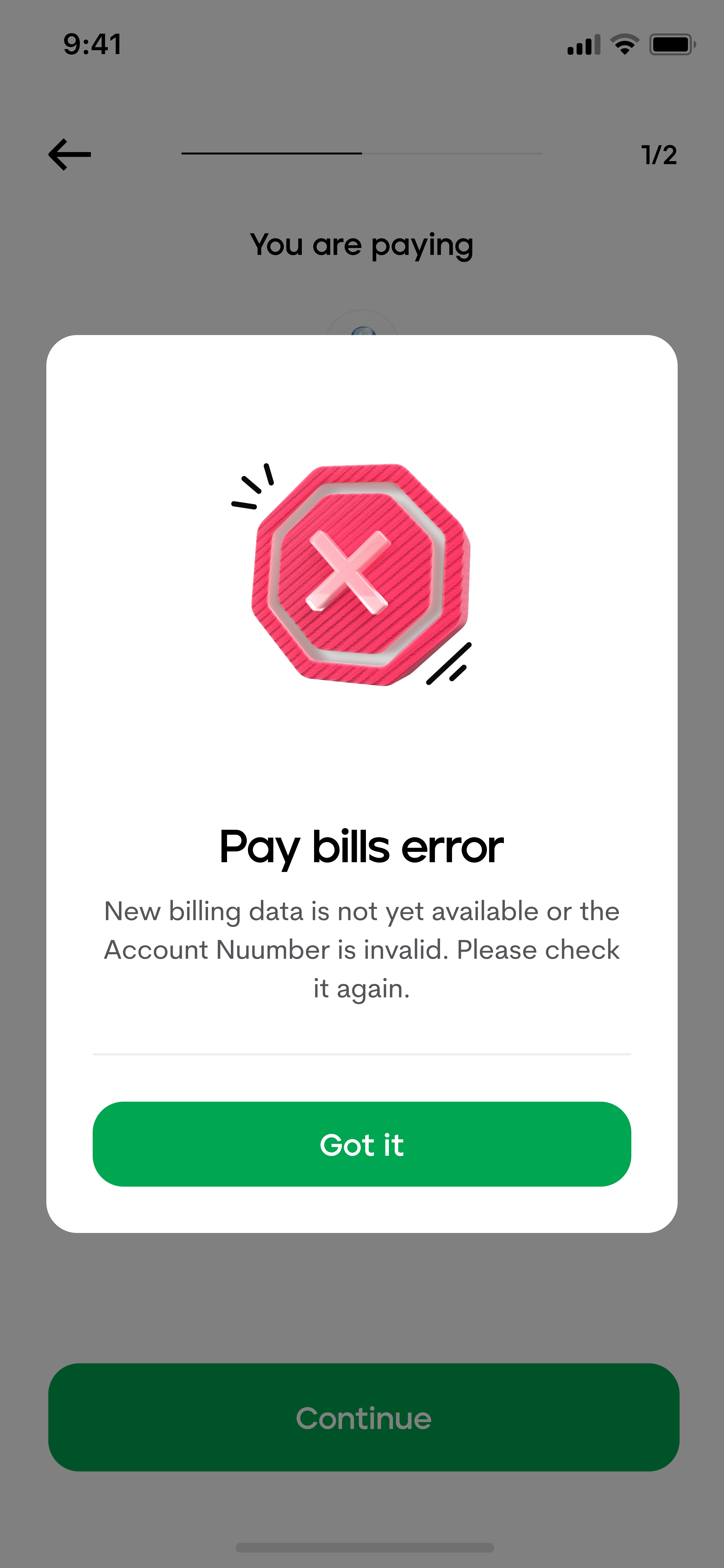
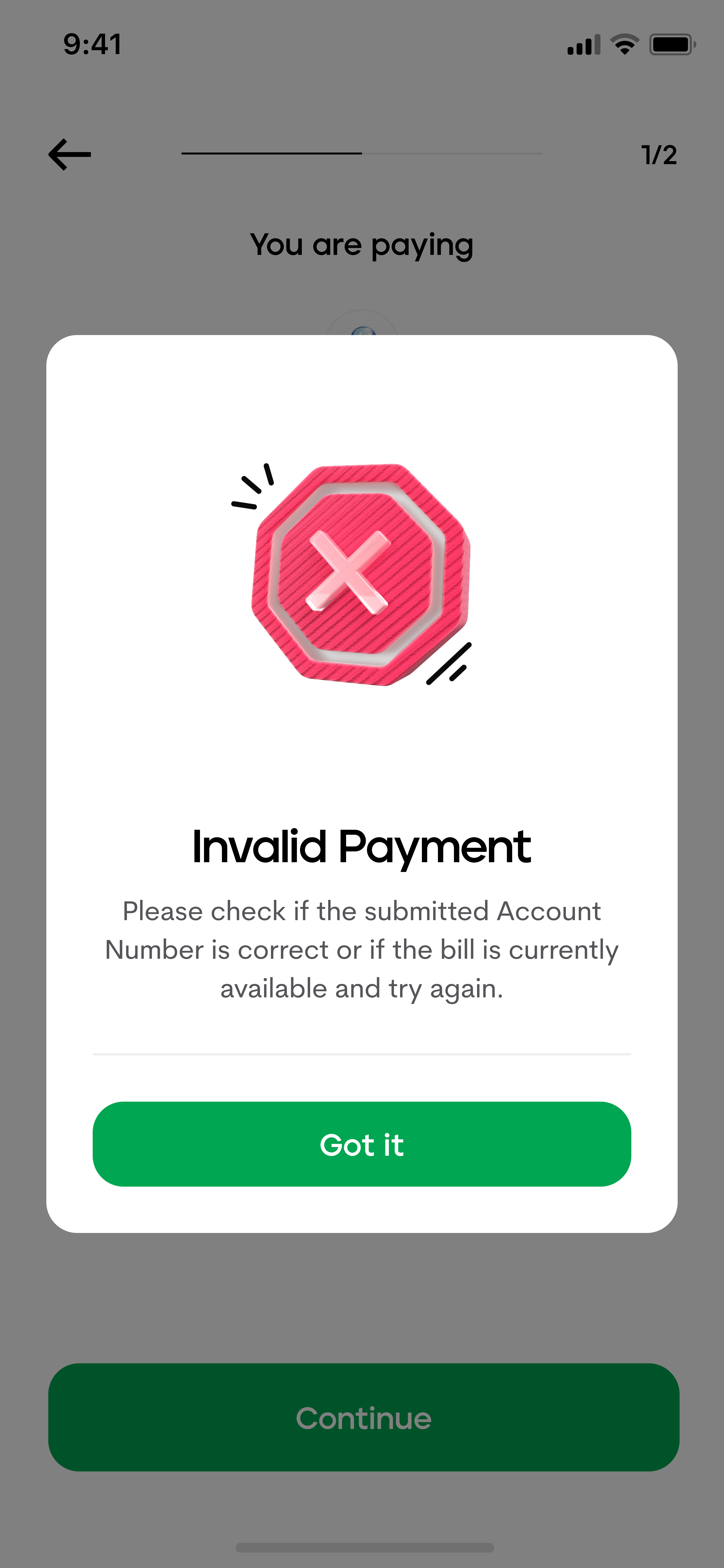
One easy way to do that is thru the deliberate use of the title copy, which we can see in the screen comparison below.
In the first screen sample, we let the user know that they’ve encountered an issue- but we do so vaguely. We tell them that something is wrong, but we do not properly equip them with the information to face the issue or set their expectations.

Yes, the bill payment encountered an error but what does that mean?
In the second screen sample, by letting them know exactly what went wrong right away, the user can immediately look towards getting the assistance to solve it or even solving it on their own.

By identifying that the issue is an invalid payment, the user no longer wonders if it’s a merchant issue, a failed internet connection, or something else. By narrowing down the field of issues, the user can feel less overwhelmed by the problem.
In very basic terms, the quicker you know what’s wrong, the quicker you feel that you can fix it.
Identify and redirect culpability
When something wrong happens on the app and the user is to blame, one of the worst things you can do is to actually say that it’s their fault.
The user is already going through the negative experience of failure. It doesn’t help us or the user if we add to that negativity—in fact, doing so might backfire and cause the user to lash out on the app.
However, it doesn’t serve us well to take the blame for something that wasn’t our fault, either. This would unfairly paint us as incompetent and, again, might lead to the user maligning the app.
So, if we can’t place the blame on the user or ourselves, where can we place it? We can place the blame on to the process which caused this failure. If we turn the process into a silent 3rd party, then it’s a win-win for the user and us as neither get the brunt of the blame.
Still a little unclear? Here’s an example of it in action:

Hopefully, it’s now clear that applying the first two types of messaging will only lead to a more negative user experience. By creatively identifying and using the process as a 3rd party, we can mitigate this danger and deliver a less painful rejection or failure experience.
TIP: Another way to reduce user culpability is by re-wording negative language
Instead of using a directly negative word (e.g. “Failed”) we can deliver the same message by stating it in an indirectly negative manner (e.g. “Was not successful”)
Point users to possible solutions or alternatives
Finally, whenever possible, you should make it a habit to direct users to solutions or alternatives.
We do not want the user’s journey and experience on the app to end on a negative note- especially when we can guide them to a more positive outcome. If the failure they encounter has a direct fix to it, then the user should immediately be told. If there isn’t a fix, then we should try our best to offer alternatives that might serve a similar role for the user. And if there isn’t anything to be done at all, then we can still prompt our user to discover other offers, applications, and the like on the app.
The impact of bad news can be greatly lessened when we pair it with a fix.

Remember, every Failure screen is an opportunity for us to show that we do put in the effort to understand and connect with our users. By approaching negative moments like these with empathy, clarity, the right amount of culpability, and a solution-oriented tone then we can still create wins out of failures.
Contributors
Learn more about Maya!
- Head back to our Maya Tech Blog for more interesting articles
- Keep up with the latest stories of innovation from Maya Stories
- or Check us out in LinkedIn.